• Notice for iPhone users: DO NOT use the image size reduction option when uploading photos to the forum. This causes portrait images to post as landscape. We have added a warning to the image insert pop-up as well.

SCRAMBLER hood decal set group buy

I believe, yes. I'd have to check with Ryan. I've only seen the charcoal in person, but I believe they make it in different colors, although I think the reflective color, ie: the "white" you see in these pictures may be different. Keep in mind, when they quoted me just the "SCRAMBLER" letters it was $75 for 18 letters total. Doing a large batch of the same set in the same color/material allows them to bring the price down. You could probably get a one-off set but it would be pricey.
 
Ryan and Jonathan are out of the office right now and I am waiting for them to give me a call back so that I can place my order:shrug:. Any news on the CJ-8.com decal?!?!:fingerscrossed:
 
Sharp, I haven't heard back from Eric (Big Walton) or Ryan about the final Cj-8.com decal. Last I HEARD it was not going to be a single color, but the final decision is with Eric.
 
Apparently the shop that did the last oval stickers we had did the art and I can't get it. Anyone handy in illustrator and want to do a quick "CJ-8" oval similar to the OBX ones with a smaller "www.cj-8.com" below it? That was the most popular design we had and was what I was thinking here.

Other option is to do the "CJ-8.com" like is in the site's header. Have it in blue and red. Can post later.
 
I do graphic design and would be happy to put something together. Just provide the dimensions you want and any other details (font/font size, color, etc...).
 
I do graphic design and would be happy to put something together. Just provide the dimensions you want and any other details (font/font size, color, etc...).

Just whatever those things typically are, maybe 3x5? I mean literally an OBX sticker with CJ-8 in place of OBX and the addition of a small "www.cj-8.com" at the bottom, black line around the outside, maybe a more Jeep-like font. I'm not picky :)
 
Here are few options that I put together for your review.

Basic;


Arc type;


Arc reversed type;


Let me know your thoughts.
 
Third one down looks best to me. Helvetica is the official Jeep font btw.
 
All look good to me, but I think the www.cj-8.com should be all lower case. To me it looks a little awkward with the upper case. Of course, I have a UNIX background and we hate mixed case in URL's, hostnames, usernames, etc.

Chris V.
 
I thought originally there was talk of two colors for the decal.:confused:

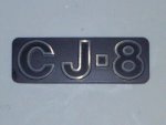
How about the "CJ-8" being the outline characters of the factory rear emblem. The background could be one color and the outline a reflective color. The outline of the oval could match the character outline color.
This would allow combinations for different vehicle paint colors.
Just a thought. :twocents:

cj8.jpg
 
All look good to me, but I think the www.cj-8.com should be all lower case. To me it looks a little awkward with the upper case. Of course, I have a UNIX background and we hate mixed case in URL's, hostnames, usernames, etc.

I gave a little thought to that when typing it out. I believe that in practical terms, URLs are not case sensitive as servers will resolve everything to lower case automatically. If mixed case is undesirable, I would rather go all caps because the lower case "j" with the dot above it doesn't look right some how. But that's just me... It's not a problem to change either way. Will of course defer for a final decision from BW.
 
You rock, thanks man.

We're just doing one design/color combo, we don't sell enough of these (maybe y'all can prove me wrong) to stock colors. Everyone always talks about wanting stuff like this, then we get it based on the interest, sell a few, and then they just sit. So we get something that works well on any Jeep.

I like the third one as well, can you do it with the URL all lowercase for comparison? It's irrelevant for actual use, but I was thinking all lowercase too, but if the "j" causes alignment issues, I'm good with the one above.
 
Here you go. I also removed the outer oval since it was only there to show where the cut edge would be.


If you are like it, just let me know where to send the file as well as your preference of file type.
Thanks, Brian
 
Actually prefer the uppercase CJ.

PM sent.

Yeah, I see what you mean. I wouldnt' mind seeing the URL in all uppercase, but I agree it looks a little awkward in all lowercase.
 
Update:

I just left the graphics place. I found an 81 CJ-7 and was able to get a rubbing off of the tailgate and front fenders and just dropped them off. Jonathan is going to scan them and make the appropriate changes. As long as the tailgate and fender embossing didn't change for a Scrambler we should now have spot-on decals. I'll keep you posted.
 
With the decals, how much smaller should the decal be? In other words, how much of a "border" should there be between the edge of the decal and edge of the embossed letter? 1/16"? 1/8"?
 
Back
Top